|
|
Post by vectisfabber on Jun 10, 2011 5:10:45 GMT -5
We lost 3 last time - Ballads, The Beatles Box, and Let It Be (Naked), with 2 votes each (although votes were cast for another 5 entries). These are left:
Please Please Me
With The Beatles (and Meet The Beatles US)
A Hard Day’s Night (UK)
A Hard Day’s Night (US)
Beatles For Sale
Something New
Beatles 65
Help!
The Early Beatles
Beatles VI
Rubber Soul
Yesterday... And Today
Revolver
Sgt Pepper’s Lonely Hearts Club Band
Magical Mystery Tour
The Beatles
Yellow Submarine
Abbey Road
Hey Jude (The Beatles Again)
Let It Be
From Then To You (US)
1962-66
1967-70
Live At The Hollywood Bowl
Rarities (US)
20 Greatest Hits
Live At The BBC
Anthology 1
Anthology 2
Anthology 3
Yellow Submarine Songtrack
1
Love
Remastered (trade dress)
|
|
|
|
Post by Blackguard on Jun 10, 2011 7:51:05 GMT -5
My vote this round goes again to From Then To You. It's a monochromatic monstrosity.
|
|
|
|
Post by vectisfabber on Jun 10, 2011 9:06:28 GMT -5
|
|
|
|
Post by John S. Damm on Jun 10, 2011 9:47:55 GMT -5
Here are the remaining album covers left for Round 4! Please Please Me 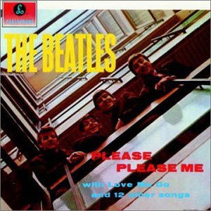 With The Beatles (and Meet The Beatles US)  A Hard Day’s Night (UK)  A Hard Day’s Night (US)  Beatles For Sale  Something New  Beatles 65  Help! 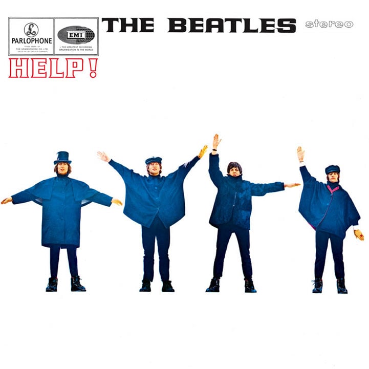 or 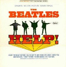 The Early Beatles  Beatles VI  Rubber Soul  or  Yesterday... And Today  Revolver  Sgt Pepper’s Lonely Hearts Club Band 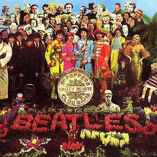 Magical Mystery Tour  The Beatles 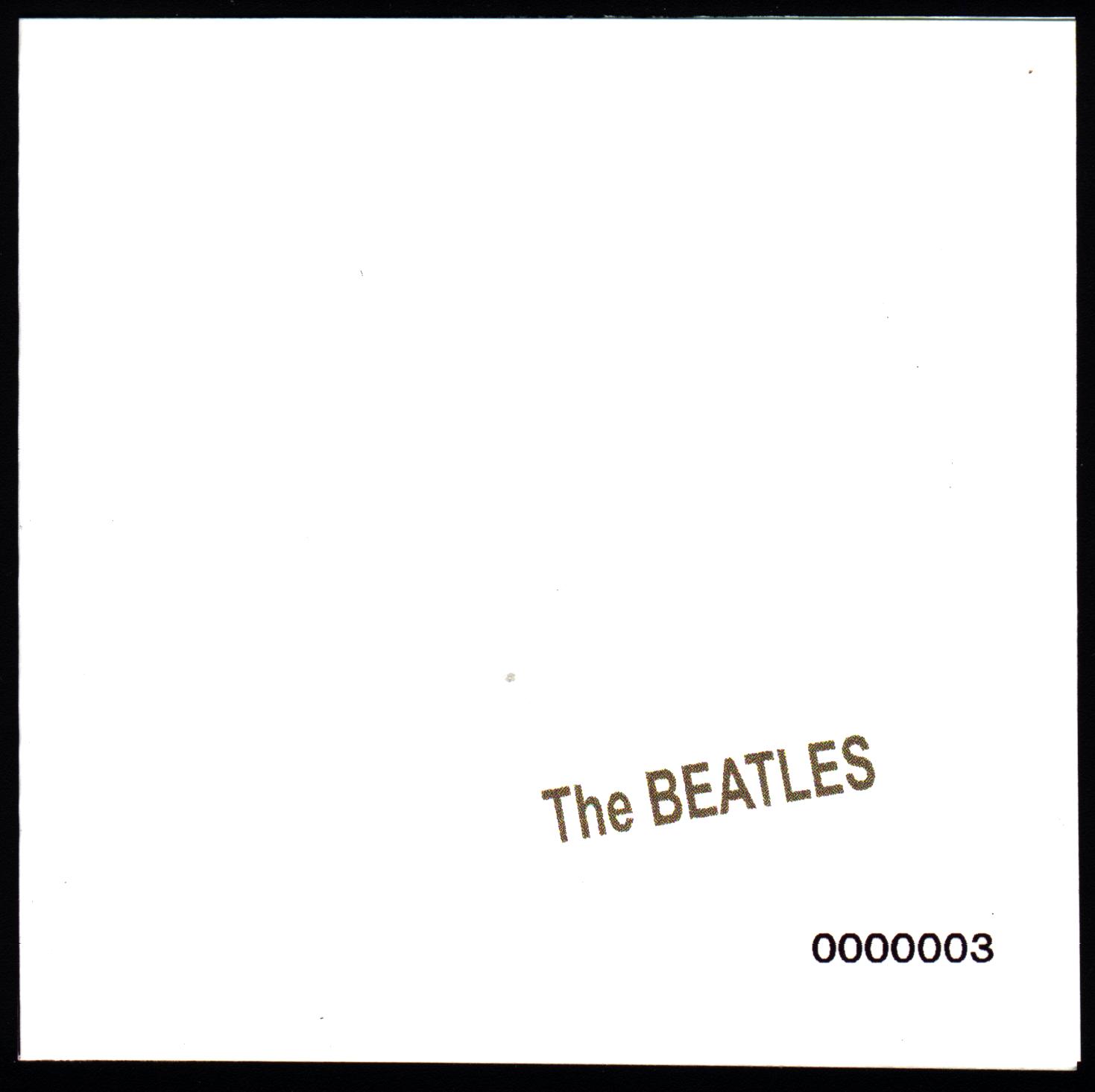 Yellow Submarine  Abbey Road  Hey Jude (The Beatles Again)  Let It Be  From Then To You (US)  1962-66  1967-70 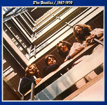 Live At The Hollywood Bowl 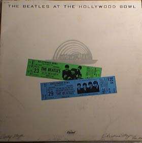 Rarities (US) _-_Front.jpg) 20 Greatest Hits  Live At The BBC  Anthology 1  Anthology 2  Anthology 3  Yellow Submarine Songtrack  1  Love  Remastered (trade dress)  or  |
|
|
|
Post by John S. Damm on Jun 10, 2011 9:56:23 GMT -5
The Beatles 20 Greatest HitsNot exciting and The Beatles were largely exciting. The images of The Beatles seen within the lettering of the band's name came from the 1976 promotional poster* for the Rock -N- Roll Music comp and it hung on my bedroom wall from 1976 through 1981. Still, that nostalgia cannot save a bland album cover. This album also had a heavily edited "Hey Jude" and perhaps some others to squeeze twenty songs onto one vinyl album. This album did not seem to create much of a Beatles' buzz in the early to mid 1980's. The arrival of Beatles on c.d. in 1987 and thereabouts created a buzz. * Here's the poster and you can see the R-N-R logo in the lower right corner: 
|
|
|
|
Post by joeyself on Jun 10, 2011 10:17:34 GMT -5
RARITIES (US)
I'd have to look, but I don't think I own this one--I got the imported UK issue, I think--but looking at the cover on the pictures John posted, I do recall how bland it was. I suspect it was supposed to kinda-sorta look like a bootleg. It was ugly like a lot of them were in the early years.
JcS
|
|
|
|
Post by coachbk on Jun 10, 2011 11:04:35 GMT -5
Rarities (US)
SAme reasons-no track listings, no rare photos or anything of that sort that might have caught the eye.
|
|
JCV
Very Clean

Posts: 545
|
Post by JCV on Jun 10, 2011 11:40:44 GMT -5
Rarities (US)I'm sticking with this pick. JCV 
|
|
|
|
Post by scousette on Jun 10, 2011 11:50:13 GMT -5
ONce again, I'm voting for Yesterday...And Today. So boring it kicks in my ADD.
|
|
|
|
Post by glenn1966 on Jun 10, 2011 13:16:35 GMT -5
My next vote is for "1". I like simplicity, but the placement of the elements is boring and unimaginative. Other than the Beatles logo, there's nothing about it that says "Beatles". To address criticisms of "A Collection Of Beatles Oldies", that cover at least had an interesting composition which you could stare at for a length of time. "1", on the other hand, is just a numeral in yellow paint, smack dab in the middle of a solid red square. I can understand the mindset in not putting the group on the cover, but does it have to be this simplistic? Then again, it sold like hotcakes, so what the heck do I know? 1 |
|
|
|
Post by mikev on Jun 10, 2011 14:05:05 GMT -5
The Beatles 20 Greatest HitsNot exciting and The Beatles were largely exciting. The images of The Beatles seen within the lettering of the band's name came from the 1976 promotional poster* for the Rock -N- Roll Music comp and it hung on my bedroom wall from 1976 through 1981. Still, that nostalgia cannot save a bland album cover. This album also had a heavily edited "Hey Jude" and perhaps some others to squeeze twenty songs onto one vinyl album. This album did not seem to create much of a Beatles' buzz in the early to mid 1980's. The arrival of Beatles on c.d. in 1987 and thereabouts created a buzz. * Here's the poster and you can see the R-N-R logo in the lower right corner: wow- I've seen that image before, but never knew it was an "official" Beatles poster. I have to think there was very little, if anything official that showed solo Beatles in a "Beatles" setting. |
|
|
|
Post by John S. Damm on Jun 10, 2011 22:28:27 GMT -5
The Beatles 20 Greatest HitsNot exciting and The Beatles were largely exciting. The images of The Beatles seen within the lettering of the band's name came from the 1976 promotional poster* for the Rock -N- Roll Music comp and it hung on my bedroom wall from 1976 through 1981. Still, that nostalgia cannot save a bland album cover. This album also had a heavily edited "Hey Jude" and perhaps some others to squeeze twenty songs onto one vinyl album. This album did not seem to create much of a Beatles' buzz in the early to mid 1980's. The arrival of Beatles on c.d. in 1987 and thereabouts created a buzz. * Here's the poster and you can see the R-N-R logo in the lower right corner: wow- I've seen that image before, but never knew it was an "official" Beatles poster. I have to think there was very little, if anything official that showed solo Beatles in a "Beatles" setting. The record stores were handing these neat posters out for free in 1976 to plug Rock -N- Roll! I had several of them(I am somewhat of a hoarder) and I bet they are still at my mother's house preserved to this day. For a young fan like me it was a neat collage giving me a quick primer on their ever-changing appearance. |
|
wooltonian
Very Clean
"Football isn't a matter of life and death - it's much more important than that." Bill Shankly.
Posts: 796
|
Post by wooltonian on Jun 11, 2011 5:20:23 GMT -5
Beatles VI.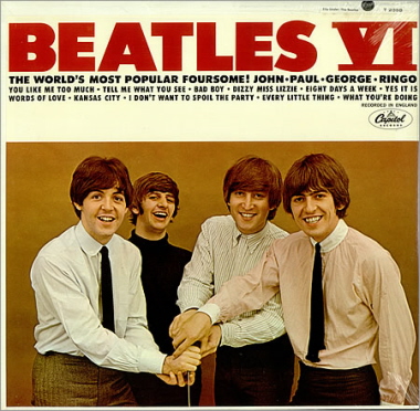 Dull and uninspired corporate hack-work with a cheesy photograph. Considering the amount of revenue that the Beatles were earning for Capitol, you think that they could have produced something a bit more inspiring than this lazy, cover-by-numbers effort.
|
|
Joseph McCabe
Very Clean
A rebel to his last breath ...
Posts: 912
|
Post by Joseph McCabe on Jun 11, 2011 17:26:06 GMT -5
Wake me up when we get to the real competition. By this I mean the covers of the original UK albums (minus maybe Let It Be's cover, and plus maybe the Hey Jude cover).
McCabe
|
|
|
|
Post by Joe Karlosi on Jun 11, 2011 17:37:02 GMT -5
I'll vote against 20 GREATEST HITS. I hated that cover back then, and I hate it now. Absolutely unimaginitive - colorless, just the Beatles' names against a white background. You know, it's interesting that in 1968 the White Album was pretty astonishing for its day in its simplicity -- but that doesn't mean we have to see it happen again and again!
(the "1" cover also stinks, and if I could vote for two I would knock that out at the same time - what the hell was it about the world's greatest band of all time having just empty covers??).
|
|
|
|
Post by joeyself on Jun 18, 2011 0:22:52 GMT -5
Is this game over? Who won?
JcS
|
|
|
|
Post by vectisfabber on Jun 18, 2011 5:27:14 GMT -5
The thread disappeared and I forgot about it! I'll update on Monday.
|
|
|
|
Post by John S. Damm on Jun 19, 2011 11:19:26 GMT -5
I don't think that anyone has voted for the collective covers of the three Anthology albums. Apple brought in Klaus Voormann which was a great idea but I have always felt the finished thing looked garish and cheap. I think of the many cool, spartan album covers to Bob Dylan's Bootleg Series then I think of our Beatles' Anthology cartoon collage.  Kind of sucks, doesn't it? Klaus left too many brain cells in the 1960's I'm afraid. |
|