|
|
Post by vectisfabber on Aug 1, 2011 4:52:44 GMT -5
Three down this time - The Early beatles
From Then To You, and Hey Jude. The survivors:
Please Please Me
With The Beatles (and Meet The Beatles US)
A Hard Day’s Night (UK)
A Hard Day’s Night (US)
Beatles For Sale
Help!
Rubber Soul
Revolver
Sgt Pepper’s Lonely Hearts Club Band
Magical Mystery Tour
The Beatles
Yellow Submarine
Abbey Road
Let It Be
1962-66
1967-70
Live At The BBC
Anthology 1
Anthology 2
Anthology 3
|
|
|
|
Post by scousette on Aug 1, 2011 11:22:05 GMT -5
The US A Hard Day's Night.
UA went tacky and commercial with this album cover. I don't like the OFFICIAL SOUNDTRACK nonsense. Rude. And I prefer the "contact sheet" motif done on the UK version.
|
|
|
|
Post by joeyself on Aug 2, 2011 7:19:11 GMT -5
I agree with Scousette--The USA's version of A HARD DAY'S NIGHT pales in comparison to the UK edition.
JcS
|
|
wooltonian
Very Clean
 "Football isn't a matter of life and death - it's much more important than that." Bill Shankly.
Posts: 796
|
Post by wooltonian on Aug 2, 2011 8:25:45 GMT -5
A hard day's night - US. I'm not sure that the EMI version of AHDN is one of the 'great' Beatle sleeves either, but it's still heaps better than this pretty lame effort. For a band that were turning over big bucks, this sleeve is cheaply produced and knocked off with minimal effort and zero imagination.
|
|
JCV
Very Clean
Posts: 545
|
Post by JCV on Aug 2, 2011 12:00:55 GMT -5
Live At The BBCJCV 
|
|
|
|
Post by Joe Karlosi on Aug 2, 2011 13:27:04 GMT -5
THE BEATLES (The White Album) -- C'mon, folks ... I know this is a classic LP, and at the time the idea of a totally stark, blank album cover was pretty damned inventive -- but it's 2011 so let's cut it down to the nitty gritty and say that plain WHITE is just plain DULL!!!
Just want to defend the US cover for A HARD DAY'S NIGHT -- it's a favorite -- something about those classic haircuts, featured prominently in black and white against that red background. I actually prefer the US cover to the UK one.
|
|
|
|
Post by John S. Damm on Aug 2, 2011 23:10:15 GMT -5
Here are the remaining album covers in play for Round 12! Sorry I'm late this time! Please Please Me 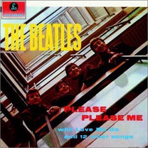 With The Beatles (and Meet The Beatles US)  A Hard Day’s Night (UK)  A Hard Day’s Night (US)  Beatles For Sale  Help! 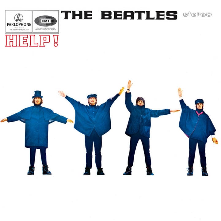 Rubber Soul  or  Revolver  Sgt Pepper’s Lonely Hearts Club Band 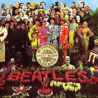 Magical Mystery Tour  The Beatles 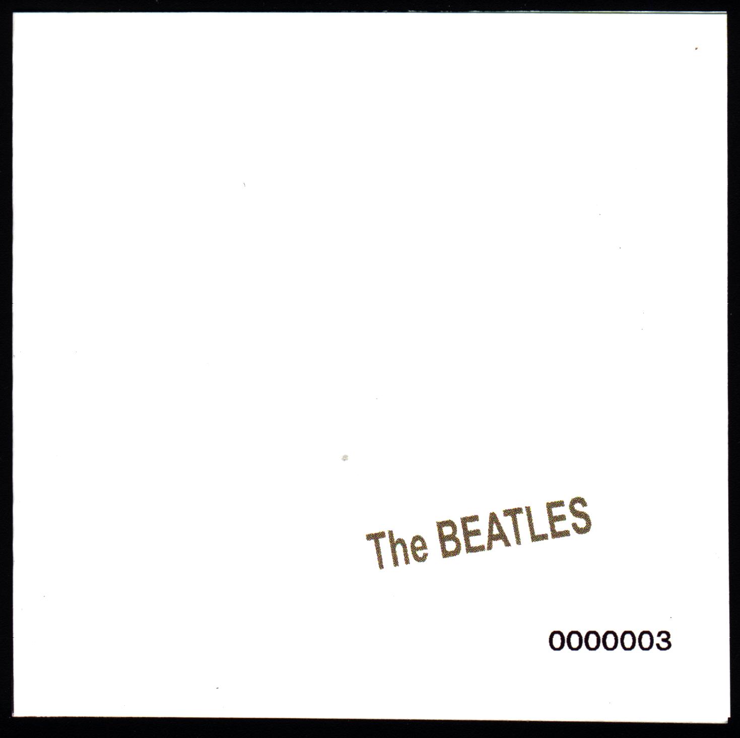 Yellow Submarine  Abbey Road  Let It Be  1962-66  1967-70 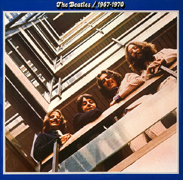 Live At The BBC  Anthology 1  Anthology 2  Anthology 3  |
|
|
|
Post by ReturnToPepperland on Aug 3, 2011 9:07:28 GMT -5
I hate all the anthology covers. The collage concept just doesn't work. There is no real focus in those covers. On the other hand, Beatles Live at the BBC is outstanding. The Help! cover is very poor. Its not eye catching and the images are too far from the camera.
|
|
|
|
Post by Snookeroo on Aug 3, 2011 17:06:10 GMT -5
Anthology 3.
Why did they put the "Rubber Soul" image of Paul in with the "Let It Be" images of the other guys. That's bothered me since I first saw it.
|
|
|
|
Post by John S. Damm on Aug 3, 2011 21:41:44 GMT -5
Magical Mystery Tour
Cheesy, sleazy and greasy. Garish is being kind. The lettering is so dated, the rainbow that turns into"Magical Mystery Tour" looks like it could have been done by mutant kindergartners and the image of the Beatles in those scary costumes is just wrong in so many ways.
I agree with RTP and Snooks that the Anthology covers blow. Klaus Voorman was so talented in the 1960's. See what excessive drug use does to one's creativity.
I also agree that BBC is an awesome, classy cover but our friend JCV is from Pittsburgh so I understand why she would vote against it. ;D
|
|
|
|
Post by Joe Karlosi on Aug 4, 2011 5:48:37 GMT -5
I agree with RTP and Snooks that the Anthology covers blow. Count me in as well - I don't care for the Anthology covers either (I should have voted against 'em). |
|
wooltonian
Very Clean
"Football isn't a matter of life and death - it's much more important than that." Bill Shankly.
Posts: 796
|
Post by wooltonian on Aug 4, 2011 6:17:48 GMT -5
I agree with all the above criticisms regarding the Anthology covers. KV went for the same basic collage idea as used on his 'Revolver' cover. However, whereas 'Revolver' was bold and striking (if a tad austere), the Anthology covers are a mish-mash. No one image from the collage really stands out and the 'poster peeling off' conceit, as well as producing a clutter of jumbled images also confuses the timeframe - as Snooks has already alluded to.
They're not terrible -- for artistic merit I would pitch them higher than most of what's already been voted off. I can see how the original idea had quite a bit of promise, but the end product is mediocre and a bit underwhelming.
|
|
|
|
Post by coachbk on Aug 4, 2011 18:42:50 GMT -5
The White Album.
JoeK beat me to it-I wanted to be the first to suggest that a plain white cover, while an interesting artistic thought, is far less interesting than what is on every other album that is left!
|
|
|
|
Post by Snookeroo on Aug 4, 2011 23:55:43 GMT -5
The White Album. JoeK beat me to it-I wanted to be the first to suggest that a plain white cover, while an interesting artistic thought, is far less interesting than what is on every other album that is left! I think you have to consider that White Album circa 1968 - not today. One year after they put out the most lavish and expensive album cover ever, they do one in pure white. It's brilliant. |
|
|
|
Post by Steve Marinucci on Aug 5, 2011 2:27:44 GMT -5
The White Album. JoeK beat me to it-I wanted to be the first to suggest that a plain white cover, while an interesting artistic thought, is far less interesting than what is on every other album that is left! I think you have to consider that White Album circa 1968 - not today. One year after they put out the most lavish and expensive album cover ever, they do one in pure white. It's brilliant. It really was a great idea. Even better, they embossed their name on the cover and numbered the original albums. |
|
|
|
Post by Joe Karlosi on Aug 5, 2011 6:16:53 GMT -5
I think you have to consider that White Album circa 1968 - not today. One year after they put out the most lavish and expensive album cover ever, they do one in pure white. It's brilliant. It really was a great idea. Even better, they embossed their name on the cover and numbered the original albums. Just to clarify: I do agree that the plain white cover of THE BEATLES was absolutely a brilliant idea -- but now that we're this far into the album cover Survivor, at what point does it get voted off? Sure, it was actually a great idea at the time -- but should it actually wind up the WINNER of this exercise? At what point does it exit? I feel the way coachbk said it: "it's a great idea, but at this point in this particular contest, is far less interesting than what is on every other album that is left!" |
|
wooltonian
Very Clean
"Football isn't a matter of life and death - it's much more important than that." Bill Shankly.
Posts: 796
|
Post by wooltonian on Aug 5, 2011 7:16:05 GMT -5
It really was a great idea. Even better, they embossed their name on the cover and numbered the original albums. Just to clarify: I do agree that the plain white cover of THE BEATLES was absolutely a brilliant idea -- but now that we're this far into the album cover Survivor, at what point does it get voted off? Sure, it was actually a great idea at the time -- but should it actually wind up the WINNER of this exercise? At what point does it exit? I feel the way coachbk said it: "it's a great idea, but at this point in this particular contest, is far less interesting than what is on every other album that is left!" I think the White Album's time will come. I don't see it remaining in this tourney into the final stages. However, as long as there are relatively lame, uninspiring album sleeves left to chuck out, it probably deserves its place if only for its sheer audacity and defiant minimalism. |
|
|
|
Post by vectisfabber on Aug 12, 2011 8:30:19 GMT -5
I'll vote for the white album, too.
Round ended.
|
|


